


SiDiary and CGMS/FGM in the logbook
Of course, it is also possible with SiDiary to take the data from an FGM (Flash Glucose Monitoring) like the Abbott Freestyle Libre or a CGMS (Continuous Glucose Monitoring System) like the Dexcom G5/G6/G7 or Senseonics Eversense and evaluate them in the logbook.
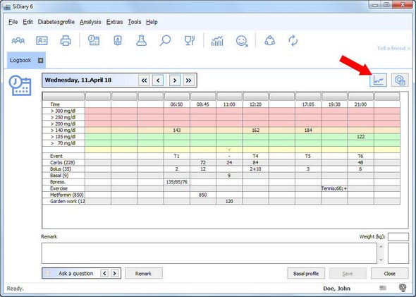
Some of these devices can store one reading every 5 minutes. That's 288 values per day. You can imagine that a table with 288 columns is anything but clear.
For this reason, SiDiary does not present these values in table form, as you know from the blood glucose logbook, but as a graph over all 24 hours of the day.
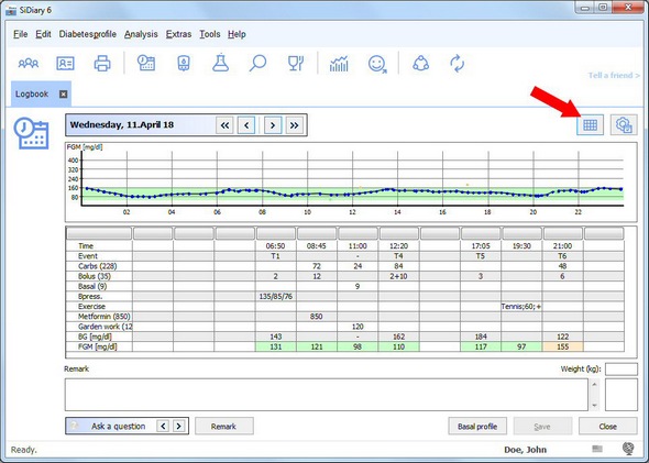
However, you can switch at any time between table form (in which only values appear that are marked as blood sugar, i.e. "measured in the blood") and curve form (in which the values of your FGM/CGMS are displayed as a daily curve) with a small button. This button is marked with a red arrow.
In the statistics, you will find an exceptional graph type for FGM/CGMS values: the glucose profile..
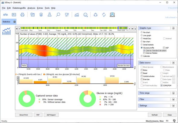
The logic behind it is similar to that of the standard day: place all values of the evaluation period in a 24-hour grid to make visible what a typical glucose day of the user looks like. If you color the standard deviations - as shown in the picture - you will also see, rapidly, at which time of day were the greatest fluctuations (here e.g. in the time between four and six o'clock in the morning).
Of course, you can also display your FGM or CGMS values in the conventional AGP graphic:
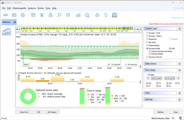
If you take a closer look at the possibilities of this form of evaluation, it certainly offers interesting evaluations. For example, the dark green cloud (the interquartile range (IQR)) tells us something about the insulin dose, while the light green cloud (the interdecile range (IDR)) tells us something about the behavior: the Injection-eating distance, the assessment of carbohydrates, physical activity or the daily routine in general. Both clouds together indicate the variability of glucose, i.e. how (un)stable the total glucose metabolism was in the displayed period.
Our calendar graphic offers a quick overview of a larger period:
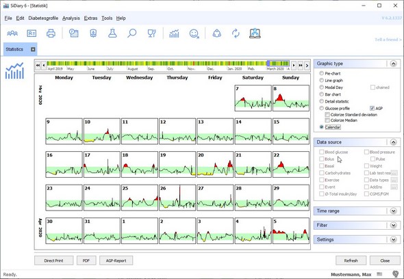
Here you can easily concentrate on the days that are conspicuous by peaks. Red peaks indicate spikes; yellow peaks indicate downward spikes. Of course, you can see this in your diary, but sometimes the famous "step backwards" is a good way to look at a trend in its entirety. This way, you can quickly find recurring patterns, that can then be approached in a more targeted manner. Especially, because after a click on such a day, this day then opens up in the detailed logbook, which hopefully gives you clues to eliminate such peaks.
For more details on "How to get the most benefit from FGM/CGMS values with SiDiary" we have compiled a PDF file, which you can download here for free. (Please click here)


